Zero Correlation
2025-03-22

1 Introduction
At MathsConf31, Catriona Agg gave a presentation on starting the A level Statistics module with hypothesis testing of correlation. As part of the presentation, she showed how she uses samples of a population to explore how the correlation coefficient can change. As well as allowing students to gain that experience, it also can lead to a better understanding of where the critical values come from as, depending on the exam board, these can appear as "magic numbers". Since the hypothesis tests are all against a null hypothesis of no correlation then it makes sense to use a population with no correlation as the sampling source.
I like to use the large data set wherever possible so when trying this myself I wanted to use data drawn from my exam board's data set (which is Edexcel's weather data). Unfortunately, none of the data has exactly no correlation1 so it is necessary to modify some slightly to achieve that.
1Admittedly, the lowest correlation is the vanishingly small but it's not actually zero.
With a little bit of geometry that's not hard to do.
2 Geometry
Statistics is geometry. At least, the theoretical side of statistics is geometry. A set of data is a vector, and set of bivariate data is two vectors in the same space. The vector might be very, very long but we aren't trying to visualise it as a vector in everyday space, just as a long list of numbers.
So we start with a set of bivariate data of size , which gives two vectors which we'll write as and . It will also be useful to have a notation for the vector (of the same length as these) consisting of all s, let's write that as .
We're doing geometry which, nowadays, means that we want an inner product (also known as a scalar or dot product). The usual one is but we'll give it a weighting by :
The weighting makes no difference to any of the geometry. We also define the associated norm by:
The correlation coefficient is closely related to this inner product. Let be the correlation coefficient between and , then with and the means of the two sets of data:
This means that the correlation coefficient is closely related to the angle between the two sets of data when viewed as vectors. An angle of (or ) means that the two data sets are perfectly aligned, while an angle of means that they are pointing in completely different directions.
3 Projections
So the aim is, given two vectors and , to adjust one, say , so that . In terms of angles, we want to adjust so that the angle between and is , as in Figure 1.
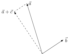
This is not difficult because the inner product is linear in each variable (separately). The adjustment to can be thought of as adding another vector to it, say . Then we want to pick so that:
The linearity means that this is the same as wanting:
Now we have a lot of choice for . The simplest is to choose to be of the form , whereupon and so we end up with:
Starting with and , this gives:
The last bit to note is that is none other than the standard deviation of :
and so the adjustment is:
4 In a Spreadsheet
Assuming the data is with in C2:C185 and in B2:B185, the formula is:
=map(
 C2:C185,
 B2:B185,
   lambda(
     x,y,
     x - correl(B2:B185,C2:C185)
      *
     stdev(C2:C185)/stdev(B2:B185)
      *
    (y - average(B2:B185))
   )
 )
This uses the relatively new functions map and lambda. A formula that doesn't use them which can be copied down a column is:
=C2 - correl(B$2:B$185,C$2:C$185)
   *
  stdev(C$2:C$185)/stdev(B$2:B$185)
   *
 (B2 - average(B$2:B$185))
The data that produced the correlation coefficient of is the cloud cover in Camborne and visibility in Leeming. The adjustment is minuscule, and invisible if the display is set to show no decimal places (the values for the visibility are in the hundreds so this is a reasonable display format).
5 Resampling
Catriona also demonstrated a Desmos activity wherein she repeatedly sampled the zero correlation population and computed the correlation coefficient of the sample (and plotted a scatter plot with a trend line). One of my aims when teaching students the statistics module is to increase their familiarity with spreadsheets so I prefer to keep all the activities based in spreadsheets rather than switching between the spreadsheet and something like Desmos. I think Desmos (and Geogebra and others) is great, but outside the classroom then familiarity with spreadsheets is going to be more useful to my students.
Plus every time I think "You can't do that in a spreadsheet, time to use a proper system" then my next thought is invariably "Oh, hang on …".
Sampling a population is straightforward. I'm sure that there are many, many ways to do it. I go for the random number method: alongside the data that I want to sample from then I create a column of random numbers, using =rand(), and then sort the data by that column (=sort(...)). Picking the first entries from the sorted list is then a random sample of data points from the population. This can be fed into a scatter plot, or a correlation calculation.
One nice thing about this is that changing the spreadsheet recalculates the random numbers and so resamples the data. Even making the spreadsheet think it's been changed will do, so pressing the delete key in an empty cell is enough. That way, students can easily resample the data to see what values of correlation coefficient are produced. In her talk, Catriona used a sample size of and I like this for an initial sample because even with a zero correlation population then the samples can produce seemingly quite strong correlations.
Students can therefore try resampling and see what they get, also by collecting in the coefficients from the class then a quick frequency table or column chart can be sketched to show a rough distribution.
However, Catriona's Desmos program also had the ability to do a large number of samples and plot a single chart of all of their correlation coefficients. At first, I thought this would be difficult in a spreadsheet since each calculation depended on resorting the data so I didn't immediately see a way to do many resamplings in an easy fashion.
The solution, though, was not far off. The key is to create a fresh column of random numbers for each sample. But rather than have columns, these can be created virtually and then fed into a formula that outputs the correlation coefficient. The formula I ended up with was the following, which is goes in a single cell – this makes it much easier to modify, say to change the sample size:
=makearray(
  500,1,
  lambda(
    p,q,
    let(
     sample,
     query(
      {$A$2:$B$185,
        makearray(
          count($A$2:$A),1,lambda(x,y, rand())
          )
      },
      "select Col1,Col2 order by Col3 limit 50"
     ),
     correl(
       query(sample, "select Col2"),
       query(sample, "select Col1")
     )
    )
  )
 )
To understand this formula, we start at its heart: the data. The original data that we are sampling from is assumed to be in columns A and B and rows to . This can be seen in the formula. Alongside that we put a virtual column consisting of random numbers. This is created by the inner makearray formula which produces an array of the given size by applying a formula to the cell coordinates (within the array). In this case the formula is simple: pick a number at random. The result is a column of random numbers, so the stuff in between the braces is two columns of data and then a third column of random numbers.
This is fed into a query command which is a simplified version of SQL. This picks out the two columns from the data but in the order specified by our column of random numbers. It also only picks out the "first" (in that ordering) items of data (in this case of them). So the result is a random sample of from the population.
Unfortunately, the correl command needs to be given two separate columns for its input and can't take a single range consisting of two columns. So we store this sample in a variable, imaginatively called sample, using the newish let command and then extract each column from that sample. This is done by the second and third query commands. The choice of order of Col1 and Col2 doesn't matter for the correlation coefficient, but would matter when calculating a regression line.
The whole formula is itself wrapped in a makearray meaning that it is repeated a number of times (in this case, ). The results of this can then be summarised and plotted.
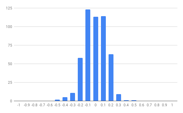
As Catriona explained in her talk, the purpose of this is to give students an understanding of what "extreme" means with correlation coefficients and so prepare the ground for the critical values in a hypothesis test.